UNC football was absolutely awful last year, which is making the high season ticket renewal price tough to swallow.
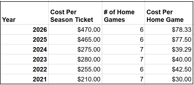
When UNC hired Belichick just before the 2025 season, the season ticket price spiked by 69%, from $275 in 2024 to $465 in 2025, despite 2025 having one less home game than the prior season. On one hand I get it… UNC’s got some big “Bills” to pay between paying the players, coaches, and ongoing facility improvements. But the bigger budget clearly didn’t lead to more wins, with UNC finishing 4-8, their worst finish since 2018.
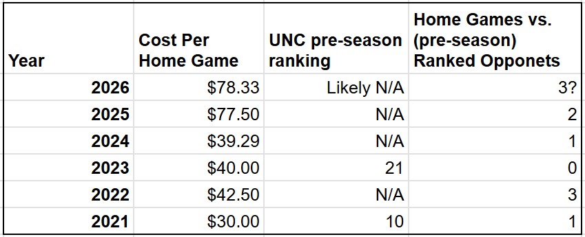
Despite last year’s disappointment, the university set the 2026 season ticket price at $470, a $5 increase from the huge spike in the prior year. Are UNC fans going to pay the price to give the team another chance? The optimist in me says this could be the year to watch a historic turnaround in person. The Heels will likely have four ranked opponents on their schedule (TCU, Notre Dame, Miami, and Louisville), with three of those matchups being played at home. I’d be kicking myself if UNC won all (or even just one) of those games and I wasn’t there.
I think we’ll find out pretty quick if this will be UNC’s year when UNC faces off against TCU in Ireland on August 29th. By the way, traveling to that game in Dublin is going to be a very tough sell for Heels fans after TCU spanked UNC 48-14 last season.
Season Ticket Prices are up 124% over the past five years; blame Belichick and the NIL era
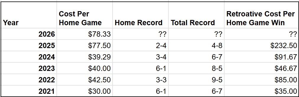
And fans are getting less bang for their buck… UNC only won two home games last year, so the price per win was effectively $232.50.
However, UNC will host three ranked opponents this year (Notre Dame, Miami, and Louisville), so blind hope may help to sell the high ticket price
Looking Ahead…
Higher ticket prices are likely here to stay following the beginning of the NIL era in 2021. The reality is that we’re not just paying for a college football game anymore, we’re paying for the talent and infrastructure of a professional sports program. Most “Power Four” schools are budgeting $20M+ to pay the players. Notably, Tennessee already added an explicit 10% “talent fee” on top of their season ticket price to help cover their roster’s payroll. While UNC hasn’t added an explicit “talent fee”, the 124% jump in ticket prices over the past five years tells a similar story. In this modern-day arms race, hope isn’t just a feeling— it’s a line item on the university’s budget, and it’s coming out of the fans’ pockets.
Most people intuitively know that the best opportunity to find a deal on tickets is just before the game. But is that one day before the game, or one hour? And how much can you actually save?
To find out, I (along with my editor George Oliver) manually tracked the price of five UNC basketball games over time; both daily and then again at multiple intervals on the day of the game. We tracked these prices on seatgeek.com, the official ticket reseller for the university. We also tracked two categories of tickets; the cheapest overall ticket (usually meaning the upstairs corner), and the cheapest lower level ticket.
Key Takeaways:
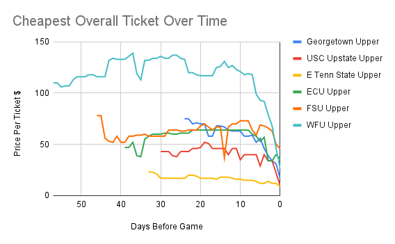
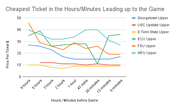
The Six Hour Golden Window: In every tested scenario, the best ticket price was available on the day of the game, usually between six hours before the game, up until the actual tipoff. As a rule of thumb, prices generally stayed flat until about 72 hours out, and then began to slide downwards. For example, the cheapest ticket to the Wake Forest game decreased from $92 (three days before the game) to $27 at tipoff, a potential savings of 71%! However, the downward slide isn’t linear, and prices can actually spike in the last 60 minutes leading up to the game (particularly for bigger conference games). For that reason, I’d recommend checking ticket prices at regular intervals on game day, and pulling the trigger when you see a standout value.
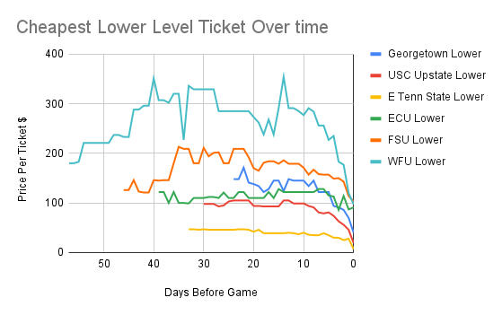
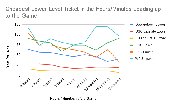
But watch out for volatility! Ticket prices can have big swings at any time, and often for no discernable reason. The bigger games exhibited the most dramatic swings, and the lower level tickets often showed significantly more variability than the upper level tickets. While nerve wracking, that variability also presents the opportunity for even bigger savings on lower level tickets. Just look at the FSU game. Three days before the game, lower level tickets were trending around $150. Thirty minutes before tip-off, tickets hit a low of $44, but if you hesitated, those tickets rebounded to $63 just fifteen minutes later. If you held out until game time, the price crashed to $34.
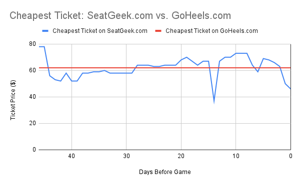
How to Plan Ahead: Sometimes you just can’t wait until the last minute to get tickets. In that scenario, I’d consider buying directly from the university at goheels.com. They only sell the less desirable upper level tickets (the good tickets are snatched up by season ticket holders), however the list price is usually less than if you bought a similar ticket from the University’s official re-seller at seatgeek.com. For the FSU game, for example, GoHeels.com had the cheaper price on 27 of the 47 tracked days (57%). However, as noted above, the tipping point is typically around 72 hours before the game. On the day of the game, tickets on seatgeek.com plummeted as low as $19, less than a third of the $62 list price on goheels.com.
Other factors that warrant additional study… There wasn’t a clear trend that UNC’s wins and losses affect future ticket prices. However, preliminary results suggested that late night weekday games are more likely to generate last minute bargains. I’d further predict that ticket prices are also dependent on the weather (e.g. some fans don’t want to travel in the rain or extreme cold). I’d also be curious if the trends noted above would hold true for other sports like UNC football or the Carolina Hurricanes. If you’re interested in further exploring these areas, let me know your hypothesis… my friend Ryan L. has already offered to write a program to automatically track ticket prices.
Diving into the Data:
Ticket prices are relatively stable up until ~3 days before the game
Lower level tickets often show more volatility than upper level tickets (which can lead to even better last minute values)
If you do want to plan ahead, and are fine with upper level tickets, consider buying directly from the university at GoHeels.com. In this example from the FSU game, GoHeels.com was often cheaper, but it’s worth checking both sites.
The best time to buy is usually between 6 hours before the game up until tipoff
But watch out! Ticket prices, especially for lower level tickets, can spike in the final minutes leading up to the game (ECU, FSU, and WFU)
Do you have another hypothesis worth testing? What should I track next? Let me know!
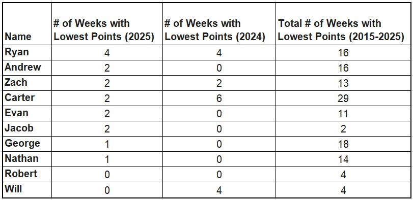
The rules of the Revolution league are always the same– if your fantasy football team scores the least amount of points across the entire league for the week, you have to chug a Smirnoff Ice and send video proof to the group. Unfortunately, my team came up short the most times this year.
Ryan’s team struggled, ending 4 weeks with least amount of points
*Carter still holds the record for most weekly last place finishes over time (29) by a pretty high margin.
*Robert (aka Bobby) is the only player who hasn’t had to chug an ice over the past two years.
*Will’s team showed tremendous improvement, going from 4 chugs in 2024 to none in 2025.
Despite only finishing one week with the lowest points, George still finished the season in last place. Bobby rightfully captured first place.
Andrew dominated the Ice Chugs and it wasn’t even close
*If you don’t send the Ice video by Thursday of the applicable week, you have to chug an extra Ice for every week that you’re late. Andrew was two weeks late following his Week 1 loss, meaning he had to chug three Ices, back to back to back. Andrew didn’t let us down; in fact, his third consecutive Ice was faster than every other chug over the past two years by more than an entire second. His only competition came from Jacob, reminiscent of their competition during the Revolution Taste Test Challenge (which Jacob won).
Highlights from the 2025 Season
Jacob’s Holiday Chug
Evan’s filter chug
George was confused and ended up on the ICE website?
Andrew’s Iconic Three Ice Performance
Ryan iced in public (with Bobby cleaning up some spillage)
Every party needs two things; a good theme, and good food.
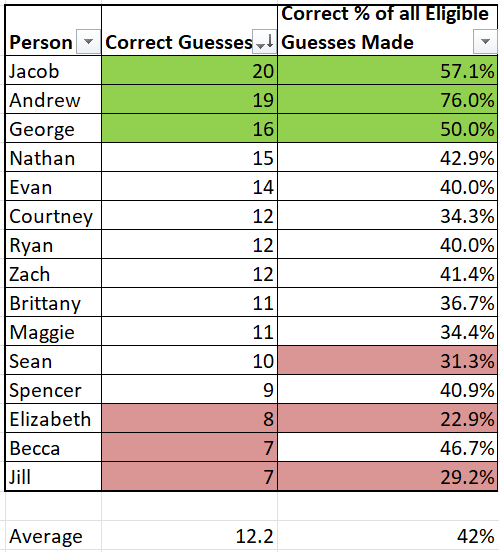
Over Thanksgiving, my friends combined both elements into one event dubbed the “The Revolution Taste Test Challenge.” Each person brought three different varieties, brands, or flavors of a certain food or drink, and we spent the party taste testing each food and trying to determine which one was which. Here are the winners, along with few takeaways that may help you out on your next shopping trip.
Winners:
1st Place: Jacob
Jacob led the pack with 20 correct picks. And he gets major props for winning the tiebreaker (which we later found out wasn’t necessary due to an incorrect tally). We gave both Jacob and Andrew two cups and had them guess which one was Smirnoff Ice and which one was Mike’s Hard Lemonade. Only Jacob was wise enough to know that both were Mike’s Hard Lemonade.
2nd Place: Andrew.
Andrew came in second with 19 correct picks, but the crazy thing is that he left three categories (representing 10 potential points) completely blank because he was too busy entertaining others. Of the 25 guesses that he actually made, he got 76% of them right, which is insane compared to the group average of 42% (and Jacob’s first place score of 57%). Note Jacob and Andrew both got five categories perfect.
3rd Place: George
George got 16 of 32 picks right (50%), and got four perfect categories.
Hot Takes and Lessons Learned:
100% of people know that Poppi is different from Coke and Pepsi, but only 9 out of 13 people (69%) could differentiate between Coke and Pepsi.
Only 3 out of 11 people recognized Halo Top (the healthy ice cream) compared to its full sugar counterparts. So you might as well get the healthier Halo Top ice cream.
100% of people confused Barbecue Wings with Honey Barbecue wings. I’m thinking George and Maggie mixed up the labels…
Six of 12 participants (50%) thought the instant mashed potatoes were homemade. My recommendation– don’t waste your time making homemade mashed potatoes.
Seven out of 10 people (70%) can correctly identify a bottom shelf glass of wine. However, the difference between a mid and upper-mid shelf bottle of wine is harder to distinguish. So next time you’re at the store, go with your gut and buy the second cheapest bottle of wine.
11 out of 12 people correctly identified homemade guacamole. It’s just different, and in my opinion, probably worth the extra time.
Zach’s mom makes a really awesome Moravian Sugar Cake.
For cookies and mac and cheese, buying the store brand is probably just fine. Only 3 out of 11 people (27%) could correctly identify Harris Teeter cookie dough, and only 3 out of 13 people (23%) could correctly identify store brand Mac and Cheese. Those odds are even worse than a true guess (33%).
That being said, it may be worth buying brand name mozzarella sticks. Five out of 13 participants (38%) correctly identified the store brand mozzarella sticks, which is just better than guessing. This doesn’t mean that the store brand mozzarella sticks necessarily are worse (or better) than the brand names, but the data suggests they may be just slightly different enough to notice.
Are you a water snob? Most people can’t tell the difference. Only our top two testers (Andrew and Jacob) got all three water picks correct. And while Dasani gets a lot of hate, only 4 out of 13 participants could pick it out of a crowd of premium brands. For the most part, water is water.
75% of participants could correctly identify Gouda, but 42% confused Cheddar with Monterrey Jack. It’s important to know how to lay out a cheese board, but it’s also okay to use a little creativity/flexibility.
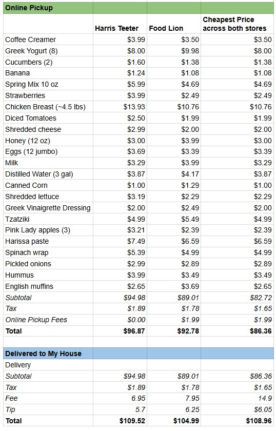
Just like my dad, I do most of the grocery shopping for our household. It’s partly because I’m a picky eater, but I also enjoy doing the math to make sure we’re getting the most value for our money. Most weeks, I shop online through Harris Teeter’s website and pick up the order the next day. But lately, I’ve been wondering– should I consider shopping somewhere else instead? And would it be worth paying extra to have the groceries delivered?
Food Lion beats Harris Teeter on price, but not convenience
Food Lion was $6.07 (6%) cheaper than Harris Teeter overall, and had the lower price on 15 of 23 items. However, Food Lion has a $1.99 fee for online pickup that brought their net savings down to $4.08 (4%).
Food Lion was significantly cheaper on fresh staples like chicken breast ($3.17 savings, or 29%), strawberries ($1.50 savings, or 60%), and spring mix ($1.30 savings, or 28%). But Harris Teeter made up some ground with a good sale on Greek yogurt ($1.98 savings, or 20%), and English muffins ($1.05 savings, or 28%).
Alternatively, if I did online pickup at both Harris Teeter and Food Lion, I could decrease the total grocery bill to $86.36, which is $10.51 cheaper than shopping only at Harris Teeter, or $6.16 than shopping at just Food Lion. Ultimately, even though it’s a little more expensive, I’m going to continue shopping exclusively at Harris Teeter because it’s slightly more convenient for me to get to.
Delivery adds about 13% to your grocery bill– not worth it unless time is your top priority
The fees are roughly the same at both stores; a $6-7 fee plus a recommended tip of around 6%. This would increase both grocery bills by roughly $12 (13%). I don’t mind picking up the groceries, so this probably isn’t worth it for me. Plus I’ll often need to go inside the store anyway in case I forgot to order something, or need to find a replacement for something that was out of stock online. If you do grocery delivery often, both stores offer membership options for $99 per year that waive the online fee (though you’ll still need to tip).
Amazon can also deliver groceries, although I’m still skeptical
In a subsequent week, I priced out a different batch of groceries on Amazon vs. Harris Teeter. Amazon’s subtotal of $73.24 was slightly cheaper than Harris Teeter’s total of $74.39, however after adding in Amazon’s service fee ($6.95) and tip ($5.00), it’s not very attractive. Plus 1. It seemed inefficient having groceries delivered from the closest Amazon Fresh store, which is 24 miles away in Raleigh. And 2. It’d be difficult to return an item or get replacements for poor substitutions. It could still be worth considering if you were dead set on delivery though since they have very competitive pricing on non-food items that you could otherwise find at the grocery store, like Tums or Naproxen. Note Amazon Fresh also has a $99/year subscription to waive their service fee (which is in addition to an Amazon Prime membership).
In conclusion, there are different ways to prioritize price and convenience (which could include delivery). However, I’m happy with the balance that Harris Teeter online pickup provides in terms of cost, convenience, and quality.
After 14 years, my HVAC bit the dust. In shopping for a replacement, I spent a lot of time considering this: Should I continue to heat my home with natural gas, or switch to an electric heat pump? Based on the lower operating costs, available rebates, and environmental factors, the heat pump was the clear winner.
What is a BTU?
Before diving into HVAC, let’s review one of the most important units in home heating and cooling: the BTU. BTU stands for British Thermal Unit, and it’s a way to measure energy — specifically, the amount of heat needed to raise the temperature of one pound of water by one degree Fahrenheit.
In HVAC terms, your system is sized based on how many BTUs per hour it can move. A typical home might need 20,000–60,000 BTU/hr depending on climate, size, and insulation. The higher the BTUs, the more heating or cooling power a system can deliver. An HVAC technician can do a load calculation to determine how many BTU’s per hour you need, or you can estimate it yourself using an online tool like this one. My own home, at 2,000 square feet in North Carolina, needs about 22,000–24,000 BTU’s per hour for heating and cooling each floor.
At a glance, Natural Gas is a lot cheaper than Electricity per BTU
Natural Gas is sold in “Therms.” Each Therm is equal to 100,000 BTU’s, and Dominion Energy charges ~$1.29 per Therm.
Electricity is billed in Killowatt-Hours (KwH). Each KwH is equal to 3,412 BTU’s, and Duke Energy charges $0.1185 per KwH.
So the cost of 100,000 BTU’s is $1.29 in Natural Gas or $3.47 in Electricity. Based on that, electricity is ~2.69x more expensive than Natural Gas per 100,000 BTU’s.
However, Electric Heat Pumps can be much more efficient than Natural Gas Furnaces at bringing heat into the home
Gas furnaces burn fuel to generate heat, and gas furnaces aren’t 100% efficient. If you input 1 Therm of Natural Gas (100,000 BTU’s) into a Gas Furnace, you’ll typically only receive an output of 80,000-96,000 BTU’s of usable heat that will be able to help warm your home. The rest of the energy is lost as exhaust. This efficiency is measured as the furnaces’s Annual Fuel Utilization Efficiency, or AFUE. A typical AFUE is 80-96%. For reference, my home’s gas appliance has an AFUE of 80%.
Heat pumps are often more efficient than gas furnaces because they don’t generate heat — they move it. Instead of burning fuel, a heat pump extracts heat from the air outside (even when it’s cold) and transfers it into your home. This process uses far less energy than creating heat from scratch. For example, if it’s 47 degrees outside, my new LG Heat Pump can transfer 3.6 units of heat into the home for every unit of electricity it consumes. This ratio is called the Coefficient of Performance (COP), and it represents the ratio of heat output to electrical energy input. The tricky part is that the COP is a variable number that depends on the temperature outside. If it’s colder outside, the heat pump has to work harder to transfer heat into the home, which means it’ll have a lower COP at lower temperatures.
If it’s really cold outside, some heat pumps can’t keep up and rely on a backup system known as electric resistance heat strips to provide additional heat. Heat strips are built into the air handler and generate heat in the same way a toaster does. They’re 100% efficient (meaning they have a COP of 1.0), however they’re far less efficient than the heat pump, which can carry a COP of 1.5-4 depending on the outdoor temperature. In my case, the analysis below ignores heat strip usage because I’m focusing on a cold-climate rated heat pump that can maintain full heating capacity down to 5°F. Given North Carolina’s relatively mild winters, I don’t expect to rely on the strips under normal conditions.
For example, if it’s 47 degrees outside, the heat pump costs ~40% less per hour to keep my home warm ($0.26/hr vs. $0.435/hr)
In this scenario, let’s assume I’d need ~27,000 BTU’s per hour to keep the inside of my home at 70 degrees. For simplicity, let’s ignore heat loss through the vents etc.
With a Gas Furnace, since my existing gas appliance has an AFUE of 80%, I’d need 33,750 BTU’s of natural gas to produce 27,000 BTU’s of heat inside the home. That means I’d need 0.3375 Therms of Natural Gas, which at $1.29 per Therm, would cost me $0.435. So with a Gas Furnace, it’d cost $0.435 to heat my home for one hour.
With a Heat Pump, to provide the same 27,000 of BTU’s of heat into my home, I’d need to consume 2.2KwH of electricity (which corresponds to a COP of 3.6). At $0.1185 per KwH of electricity, it would only cost me $0.26 to heat my home for one hour.
But as it gets colder, those savings drop. At 30 degrees, the Heat Pump is only 13% more efficient per hour ($0.378/hour vs. $0.435/hour).
Let’s pretend it’s 30 degrees outside now. The Natural Gas Furnace still requires the same amount of Natural Gas to produce 27,000 BTU’s. So the cost there is still $0.435/hour.
But the Heat Pump has to work harder to transfer heat now. To bring 27,000 BTU’s of heat into the home, it now needs 3.19kw of electricity per hour (which corresponds to a COP of 2.55). At $0.1185 per KwH, it would cost $0.378 to heat my home for one hour.
When it’s really cold outside (~22 degrees F or lower), the Gas Furnace is more cost efficient per hour compared to the Heat Pump
The breakeven point is typically when the Heat Pump’s COP drops below ~2.5. Natural Gas is ~2.5x cheaper than electricity, so in order for the Heat Pump to be more cost efficient, it needs to be ~2.5x more efficient with its inputs.
With the Bosch heat pump below (which is very similar to my new unit), this breakeven point happened at 22 degrees F. If it’s warmer than 22 degrees outside, the Heat Pump is more cost effective. But if it’s less than 22 degrees F, the Gas Furnace is more cost effective. In North Carolina, the temperature doesn’t drop below 22 degrees very often, so the Heat Pump should be more efficient on an annual basis.
Overall, I expect this Heat Pump will save ~$336.74 per year in utility costs compared to my existing system
Cooling costs should be ~$182/year (35%) lower with the new system compared to my existing system
I estimate that I spent ~$525.79 on cooling my home last year (which is probably a low-end estimate). During the winter months of November-March (when the AC was off), my average electric bill was $83.68. During the warmer months of April-October (when the AC was on), my average electricity bill increased to $158.79/month. By subtracting those two numbers, I estimate that it cost ~$75.11 per month to cool my home , or ~$525.79 total for the seven months of April-October.
The efficiency of Air Conditioners is measured by its SEER rating (Seasonal Energy Efficiency Ratio), which indicates the amount of cooling produced by a air conditioner for every unit of energy consumed. A higher SEER rating means the unit is more energy-efficient. My existing AC has a SEER 13, whereas the new Heat Pump has a SEER of 17.5. Therefore I estimate that the new system will be ~35% more efficient (17.5/13 -1) than my existing system, which will save ~$182 in annual cooling costs.
Heating costs should be ~$232.95/year (28%) lower with the new system compared to my existing system
Last year, I estimate that I spent ~$545.79 on heating my home (again this is probably a low-end estimate). My average natural gas bill during the summer months of April-October was $42.91, and the heat was off throughout this period. During the colder months of November-March, my average bill was $152.06, suggesting that having the heat on cost ~$109.15 per month on average ($152.06 – $42.91). Based on that, I estimate that the total cost for heating my home was $545.75 for the five month period of November-March ($109.15/month * 5 months).
It’s more difficult to estimate my projected heating costs for next year. I’ll estimate that a rough average temperature for the heating season (November-March) is ~47 degrees F. At that temperature, the new heat pump uses 2.2Kw per hour, and the system would run ~10 hours per day for this 150 day period. At $0.1185/hour, I project it will cost ~$391.05 to heat my home for the season, which is ~28% more efficient than my bill from last year.
Heat Pumps are often more expensive upfront but I should make back the difference pretty quickly through:
The government provides a $2,000 tax credit for upgrading to a high efficiency heat pump.
Duke energy provides ~$825 in rebates for upgrading to a high efficiency heat pump.
The monthly operating costs are expected to be $336.74 less per year compared to my existing system.
Come back next year and I’ll update my analysis with the real-world results.
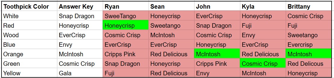
To help celebrate John’s birthday, Martha put together a blind taste test for seven different apples. Can most people tell the difference between different types of apples?
The answer was a clear “no.”
The math suggests we could have guessed the same amount of correct answers just by chance. For example, with each apple, you have a 1 in 9 chance of guessing the right variety since there were 9 options listed in the answer key. So across 7 apples, statistics suggest the average person would get ~0.778 picks correct (1/9 chance of a correct pick * 7 picks). As a whole, our group made 4 correct guesses across five contestants, meaning our group had 0.8 correct picks per person on average (4 correct picks / 5 people). This rate of 0.8 average correct guesses per person was almost exactly even with the blind guessing prediction of 0.778 correct picks per person.
That being said, if you have a favorite apple, you may be able to pick it out of a crowd. Kyla easily picked out her favorite (Cosmic Crisp), and I picked out my favorite (HoneyCrisp). In a way, this helps me justify paying the high price for Honeycrisp at $4.49/lb.
Snap Dragon, EverCrisp, Cosmic Crisp, SweeTango, and Honeycrisp were often confused for each other in the chart below, likely because they’re all similar in flavor and texture.
McIntosh stood out more clearly, maybe because of its distinct softness.
Almost five years ago today, I was on the fence if meal delivery boxes were worth the added cost. The COVID lockdowns had just gone into effect, and with all restaurants closed, I was looking for new foods and recipes. I also had plenty of time to run a cost-benefit analysis comparing the cost of the meal delivery box to buying the same ingredients at the grocery store.
Since 2020, the Consumer Price Index (an estimate for household inflation) has risen by 22.3% according to the U.S. Bureau of Statistics. So, how much does it cost to buy the same ingredients at the grocery store today vs. in March 2020? And has the value of meal delivery boxes changes? To find out, I’ve tracked, analyzed, eaten, and broken down the costs of four meals over time; Falafel Veggie Bowl, Loaded Black Bean Tacos, Chicken Caprese Sandwich, and Pizza Tortellini.
The cost of ordering these four meals from Dinnerly increased from $51.32 in 2020 to $67.91 in 2025, a 32.3% increase. This means that the cost of meal delivery boxes has risen significantly faster than inflation. And Dinnerly is actually one of the cheaper meal delivery options– a similar box from Hello Fresh would cost $92.73. The only way to argue that a meal delivery box would save money is by comparing it to the cost of eating out. For example, buying four #1 combos for two people at Chickfila would cost $74.05. Or even worse, using Uber Eats to deliver two Crunchwrap Supreme combos from Taco Bell four times would cost $135.
However, despite inflation, the cost of buying these ingredients at Harris Teeter actually went down over time, from $48.78 in 2020 to $47.06 in 2025. This fact doesn’t disprove inflation, rather I think it shows that I hit the sales right this year. The biggest savings came from a sale on taco seasoning ($1.99 down to $0.59), buns and tortellini (both down $1.01), and tortillas (down $0.99). Meanwhile, staples like cheese, chicken, and tomato sauce were all up (21%, 8%, and 79%, respectively).
In 2020, the added cost of ordering the meal delivery kit was only $2.52 per week, or around 5%, which I thought was worth. However, today that premium has increased to $20.85 per week, or 44%. Meal delivery boxes may still make sense for people who eat out for every meal or value convenience over cost. But for the rest of you, I’ll see you at Harris Teeter.
My dad was a general contractor so I used to hear those words a lot growing up. Well, I’ve been hearing them (and saying them) a lot lately too…
Since Brittany and I bought our house in June 2022, we’ve been to Lowe’s 94 times over the course of about two and half years, or about once every 10 days. My personal record was five trips in one day when I was trying to figure out the right size pipe and fittings to install a new sink (fifth time was the charm).
Cost wise, we’ve spent $6,075.84 at Lowe’s since buying the house, according to our credit statements. That’s about $65 per trip, however that average was skewed by a few large purchases including a new oven (~$1200) and 15 gallons of paint to stain the fence (~$600). The median of $31 is probably a better representation of our standard trip to Lowe’s.
To be clear though, our house wasn’t in bad shape by any means when we bought it. However we’ve been trying to flex our DIY skills as we’ve learned how to do routine maintenance (like taking care of the lawn), basic repairs (like changing the garbage disposal), and also some tasteful upgrades (like updating the bathroom). Take a look at my last DIY blog to follow along with some of the projects we’ve tackled.
While spending $6,000 over 2.5 years sounds like a lot, homeguide.com estimates that home maintenance costs between 1-4% of a home’s value per year. We’ve certainly had to spend money at other places (i.e. 14 trips to Home Depot costing a total of $779.71), however we’re still probably on the lower end of that spectrum given that we’ve done a lot of the work ourselves. Rather than money, we’ve paid the price with our time… and trips to Lowe’s.
So next time you hear someone talking about the “joys of home ownership,” it really just means going to Lowe’s.
Can you guess where on the graph we bought the house?
Over the past year, Brittany and I have embarked on a cinematic journey, watching 46 movies in theaters over 365 days. From Halloween thrillers to box office flops, this has sparked our curiosity to learn more about the trends and insights into the movies we love. Join us as we dive into the data behind movie budgets, ratings, and profits, along with a brief refresher from your high school statistics class.
We prefer to go on Thursday’s when new movies are released. We saw 24 of 46 movies on opening weekend
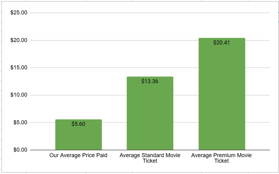
Using the AMC A List (movie subscription pass), we paid ~$5.60 per ticket; 59% less than a standard ticket ($13.36) and 73% less than an Imax/Dolby ticket ($20.41)
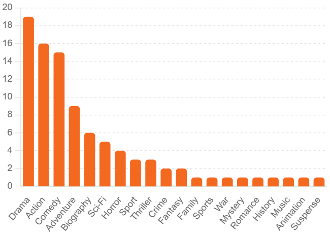
Most of those movies we saw were dramas, action movies, or comedies (note some movies had more than one genre)
We saw six movies from both Paramount Pictures and Sony Pictures
Ready to dive deeper into the stats?
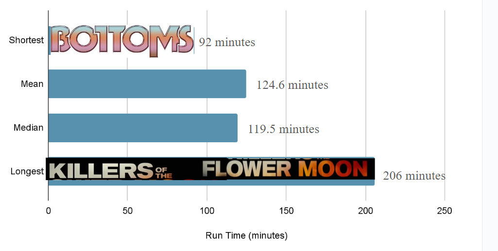
You could watch the shortest movie (Bottoms) 2.2x before the longest movie is over (Killers of the Flower Moon).
Of all the movies, these were the biggest financial hits (at least for opening weekend), generating more box office revenues during opening weekend (red) than the film’s budget (blue)
Generally, the production company gets to keep 50-60% of the box office revenues from opening weekend and the theater owner get to keep the remaining 40-50%. However, this split is contentious and often varies based on the strength of the film and the bargaining power of both the production company and the theater. After opening weekend, that split often shifts over subsequent weeks such that the production company’s cut decreases and the theater’s share increases.
There are plenty of exceptions but opening weekend box office revenue carries an outsized importance because it often sets the tone for the film’s entire theatrical run. By Sunday of opening weekend, studio executives can predict with great accuracy what a movie will earn by the time it leaves the cinema. Ticket sales are the largest driver of income for movies, although not necessarily the most profitable because of taxes and the cut owed to the theater. Other sources of revenue for the production company include DVD sales, on-demand rentals, licensing income from streaming services, and merchandising.
This reliance on opening weekend box office revenues is changing though. Film critic Bilge Ebiri explained, “Hollywood is in the midst of a transition… [they’re creating] Fewer gigantic productions that need massive opening weekends to justify their humongous costs; [and] more solid films that can turn a profit over a few weeks and months thanks to good word of mouth. The smash-and-grab opening-weekend strategy was never going to be sustainable, and the industry had become alarmingly reliant on an increasingly small handful of titles saving their bottom lines.”
This transition may include a larger reliance on sequels and related works. Of the five movies above, four aren’t entirely original stories. Barbie has the doll, Five Nights at Freddy’s is based on a video game, and Spider man and Maxxxine are both sequels. In total, 14 of the 46 movies we watched were direct sequels or part of a movie series, and several more were based on books or other works. TheFilmAutopsy explained sequels “just make more money,” and the limited data we collected tends to agree. On average, a sequel generated box office revenues equal to ~50% of its total budget during opening weekend, whereas novel movies only returned ~41%.
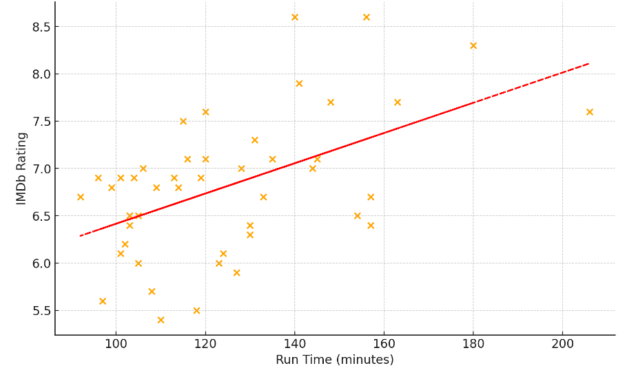
In general, longer movies had moderately better reviews (r=0.52, p=.002)
The correlation coefficient (aka “r” value) measures the strength and direction of the linear relationship between two variables. The value can range from -1 to 1. A value of 0 would indicate that two variables aren’t related at all (like your shoe size and reading ability), whereas a value of 1 indicates a perfect positive relationship between two variables (like degrees Fahrenheit and degrees Celsius). The r value of of 0.52 here indicates there’s a moderately positive relationship between a movie’s run time and it’d IMDb rating.
The p-value helps determine the significance of the results. In this scenario, the p-value is the probability of observing the results below if run time and IMDb rating were not correlated at all (meaning an r-value of 0). This dataset has a p-value of 0.0002 (0.02%), giving us confidence that these results are not random and that there is positive relationship between run time and IMDb rating. To be considered statistically significant, most fields look for a p-value of less than .05.
The line of best fit (aka regression line) shown in red is a straight line that best represents the data on the scatter plot below. The formula for the straight line can be line described by the formula y=mx+b, where y is the IMDb rating, m is the slope of the line, x is the movies run time, and b is a constant representing where the line crosses the y axis. Altogether, we can use this formula to estimate a movie’s IMDb rating as “IMDb Rating=0.016×Run Time+4.817.” The constant of 4.817 isn’t meaningful in itself, but suggest a movie with a run time of 0 minutes (a hypothetical scenario) would have an IMDb rating of 4.817. For every incremental minute, the slope of the line suggest that the IMDb rating would increase by 0.016 point.
This data makes intuitive sense given that longer movies have more time to develop characters and storylines, which could potentially lead to a better overall movie and higher ratings.
But strangely, getting better reviews doesn’t necessarily mean that more people are going to go see that particular movie on opening weekend (r=0.243, p=0.104)
The trend line in red does indicate a weak positive correlation between a movie’s IMDb rating and opening weekend box office revenue. However, the p value of 0.104 suggests that there’s a 10.4% of obtaining this result (or something even more extreme) even if the variables weren’t related at all. Based on that, we can’t confidently claim that higher IMDb ratings correlate with higher opening weekend box office revenues.
Why aren’t these variables more correlated? I had a few theories:
Opening weekend box office revenue is probably more related to how much the production company spent on marketing and advertising for the movie beforehand. You’re probably not going to go see a movie that you’ve never heard of, right? I’ll investigate this further below. Note I would have liked to use total box office revenue instead of just opening weekend box office revenue, however it wouldn’t have been fair since several of these movies are still in theaters.
More people want go to the movies around certain holidays or peak seasons (like Halloween or Valentine’s Day), even if the movies aren’t that great. For example, Brittany and I went to see the horror movie “Five Nights at Freddy’s” around Halloween and the romantic comedy “Anyone But You” around Valentine’s Day, even though we weren’t particularly excited about either film.
Reviews are a lagging indicator. I’ve noticed that a movie’s IMDb rating tends to start out very high and gradually decrease over time. For example, if you go see a movie on opening night, you probably already know that you were going to like the movie before it even started. But as more people go see a movie, the rating usually decreases closer to it’s truer and long-term average. Since these movies all came out at different times, this probably isn’t a fair dataset. Or maybe IMDb is just rigged.
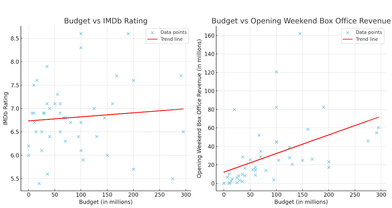
Just like politics, it’s all about the money. Higher movie budgets don’t lead to better reviews (r=.089, r=0.55), but they do lead to higher opening weekend box office revenue (r=0.467, p=.001).
The chart on the left is all over the place, driving home the point that higher budgets don’t correlate with higher IMDb ratings. The r value indicates a weak correlation, however even if that were true, the p-value of 0.55 indicates that there’s a 55% chance that the observed data could occur even if budget and IMDb were totally unrelated. Therefore, we conclude that there’s no significant evidence that higher budgets lead to higher IMDb ratings.
On the other hand, the chart on the right indicates that higher budgets do lead to higher opening weekend box office. This isn’t a surprise. With more money, studios will bring in more famous actors, hire better producers, and spend more money on advertising. The r-value of .467 suggests a moderately positive correlation between a movie’s budget and opening weekend box office revenue, and the p value of .001 gives us high confidence that the correlation is statistically significant. The slope of the trend line (m=.202) suggests that for every additional million dollars in a movie’s budget, the opening weekend box office revenue is expected to increase by approximately $0.202 million (or $202,000).
So what does all this mean?
Our sample size is too small to reach any major conclusions other than we’ve had a great time on our 46 date nights at the movies. We’re looking forward to more movies coming up (Joker 2, Wicked, Bettlejuice, etc.), which may turn into more blog insights, but until then, check out my last movie blog where I’m “Reviewing Movie Reviewers.”